
Redesigning CBC website with a user-first approach and cleaner visual structure
This was a university group project carried out by a team of four. We focused on redesigning CBC.ca, the website of Canada’s national public broadcaster. Together, we analyzed the existing platform’s usability and visual design issues, then approached the redesign with a strong user-centered focus. The result is a cleaner, more structured, and more accessible news experience tailored to user needs.
As the project lead, I coordinated the team’s workflow and helped shape the overall design direction. My main focus areas were the heuristic expert analysis, the creation of wireframes, and the development of the design system. I ensured consistency across the design process and guided decisions based on usability principles and user feedback.
User Persona and Journey: I created a detailed user persona and mapped out their journey through the site to better understand pain points and key tasks.
Heuristic Expert Analysis: Using Nielsen’s 10 heuristics, I evaluated the original website to identify usability issues and guide design decisions.
Moodboard: I developed a visual moodboard to establish a tone that was clean, informative, and trustworthy..
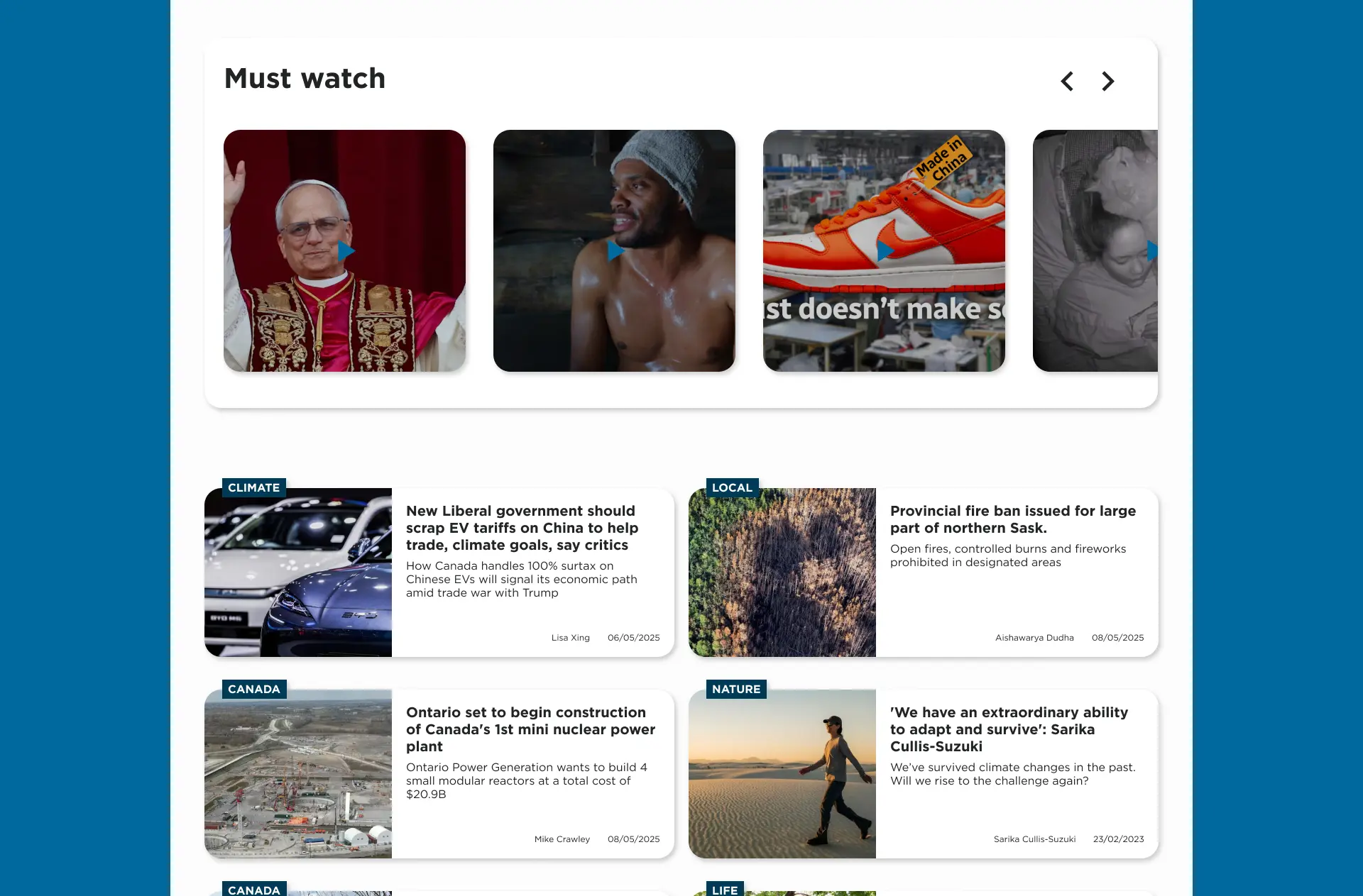
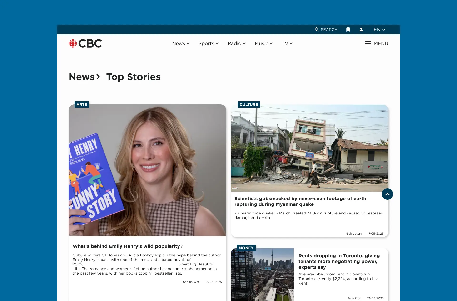
Sketches and Wireframes: Early design concepts focused on improving visual hierarchy, reducing clutter, and reorganizing content for better usability.
Guerrilla Testing: I conducted quick user testing sessions with real users to evaluate wireframes and collect feedback. Insights from this phase directly informed the changes made in the final UI.
Mockups and Design System: Final high-fidelity mockups were created in Figma, incorporating all improvements based on research and testing. I also built a design system to ensure consistency across components, typography, and layout.
The redesign aimed to create a cleaner, more accessible, and easier-to-navigate news platform. I prioritized content readability, simplified navigation, and visual consistency. The layout encourages scanning, while the interface feels modern and structured without overwhelming the user.
The result is a fully redesigned concept for CBC.ca that reflects a more organized, intuitive, and user-first experience. This project highlights how combining UX research, usability testing, and thoughtful visual design can transform a dense media site into a clear and engaging digital product.